The project
Use a short finished sequence with three suitable moments for typography: an opening, a person or place identification, and a closing credit. The goal is a simple visual system that belongs to the film.
1. Choose the hierarchy
Write the actual words before styling them. Keep the main title concise, the lower third informative, and the closing credit unambiguous. Decide which line is primary and which is supporting information.
Choose one type family or a deliberate pair. Using a new typeface for every card makes consistency harder to maintain.
2. Start from the flat presets
Open Titles at the intended playhead position. Use Cinematic title or Editorial for the opening, Lower third for the identification, and End credits for the closing.
Select each title clip and replace the sample text. Open Font, color & layout to refine alignment, spacing, color, and shadow.
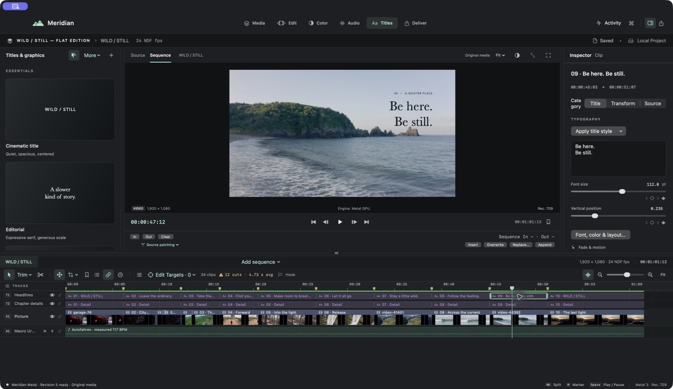
3. Compose against the footage
Place text in a quiet part of the picture. Preview the entire shot for changing contrast. Use safe-area guides and keep a comfortable distance from subjects and frame edges.
Check line breaks intentionally. If the title feels cramped, shorten the words or change the layout before making the text very small.
4. Give the words time
Trim title durations according to reading time and the pace of the scene. Preview the preset’s fade and motion before adding more animation. Keep opening and closing behavior consistent across the set.
Review your result
Watch a delivery-size export. Check spelling, contrast, line wrapping, and the first and last visible frames. Revisit every title when adapting to a vertical canvas; a good landscape layout needs its own portrait review.